barplot(...) funtion plot a bar chart. It's usage is:
barplot(height, width = 1, space = NULL,
names.arg = NULL, legend.text = NULL, beside = FALSE,
horiz = FALSE, density = NULL, angle = 45,
col = NULL, border = par("fg"),
main = NULL, sub = NULL, xlab = NULL, ylab = NULL,
xlim = NULL, ylim = NULL, xpd = TRUE, log = "",
axes = TRUE, axisnames = TRUE,
cex.axis = par("cex.axis"), cex.names = par("cex.axis"),
inside = TRUE, plot = TRUE, axis.lty = 0, offset = 0,
add = FALSE, args.legend = NULL, ...)
height: Vector of each bar heights
width: Vector of bar width
space: Space between bars
col: Vector of color for each bar
...
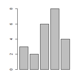
First let's make a simple bar chart:
>x <- c(3,2,6,8,4)
>barplot(x)

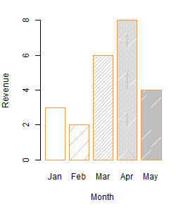
Let's add some annotations:
>barplot(x,border="tan2",names.arg=c("Jan","Feb","Mar","Apr","May"),
+ xlab="Month",ylab="Revenue",density=c(0,5,20,50,100))

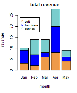
Suppose the bar chart above is about software department of our company, we are going to
compare other department's revenues including hardware and services:
>A <- matrix(c(3,5,7,1,9,4,6,5,2,12,2,1,7,6,8),nrow=3,ncol=5,byrow=TRUE)
>barplot(A,main="total revenue",names.arg=c("Jan","Feb","Mar","Apr","May"),
+ xlab="month",ylab="revenue",col=c("tan2","blue","darkslategray3"))
>legend(x=0.2,y=24,c("soft","hardware","service"),cex=.8,
+ col=c("tan2","blue","darkslategray3"),pch=c(22,0,0))

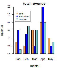
Let's compare the data sets horizontally:
>barplot(A,main="total revenue",beside=TRUE,
+ names.arg=c("Jan","Feb","Mar","Apr","May"),
+ xlab="month",ylab="revenue",col=c("tan2","blue","darkslategray3"))
>legend(x=1,y=11,c("soft","hardware","service"),cex=.8,
+ col=c("tan2","blue","darkslategray3"),pch=c(22,0,0))
