plot() is a generic X Y plotting function.
plot(x, y = NULL, type = "p", xlim = NULL, ylim = NULL, col="black",
log = "", main = NULL, sub = NULL, xlab = NULL, ylab = NULL,
ann = par("ann"), axes = TRUE, frame.plot = axes,
panel.first = NULL, panel.last = NULL, asp = NA, ...)
x,y:Vector of coordinates
main, sub: an overall or sub title for the plot
xlab, ylab: a title for the x or y axis
xlim, ylim: set the limits of the x or y axis
col: color of the plot, see color for color's chart
asp: the y/x aspect ratio
type: character vector consisting of one or more of the following: "p" (points), "l" (line), "b" (both), "h" (histogram),
"c" (for the lines part alone of b), "o" (both overplotted), "s" (stair steps), "S" (other steps), "n" (no plotting).
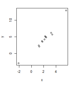
First let's make a simple plot:
>x <- c(1.2,3.4,1.3,-2.1,5.6,2.3,3.2,2.4,2.1,1.8,1.7,2.2)
>y <- c(2.4,5.7,2.0,-3,13,5,6.2,4.8,4.2,3.5,3.7,5.2)
>plot(x,y)

To save the image as a file, Plots panel->File->Save as.
The par(...) controls the general layout of the plot. For example,
par(mar = c(5, 4, 2, 1)) defines the bottom margin as 5, left margin 4,
top margin 2 and right margin as 1.
The default type is a point plot (type="p"). The possible types include:
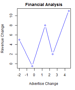
>x <- c(-2,-0.3,1.4,2.4,4.5)
>y <- c(5,-0.5,8,2,11)
>par(mar = c(5, 1, 1, 1))
>plot(x,y,type="l",col="blue",xlab="Advertise Change",
+ ylab="Revenue Change", main="Financial Analysis")

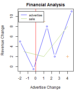
Add more data to the plot:
>abline(v=0,col="red")#add a vertical line at x=0 >points(c(1,4),c(9,2),pch=3,col="tan2")#add two points >x2 <- c(-1.5,1,4) >y2 <- c(3,2,8) >lines(x2,y2,col="darkolivegreen3")#add aother group of data >legend(x=-2.2,y=11,c("advertise","sale"),cex=.8, + col=c("blue","darkolivegreen3"),lty=c(1,1))#add legend

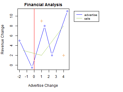
If we want to move the legend out of the main plot area, we need some more work.
First use layout(...) function to define 2 plots on one layer side by side,
and then we plot the same data on both plots, with the plot on the right side in white color,
thus invisible (just providing the scale), and finally we plot the legend on the second plot.
>x <- c(-2,-0.3,1.4,2.4,4.5) >y <- c(5,-0.5,8,2,11) >layout(matrix(c(1,2), nrow = 1), widths = c(0.6, 0.4)) >par(mar = c(5, 4, 2, 1)) >plot(x,y,type="b",col="blue",xlab="Advertise Change", + ylab="Revenue Change", main="Financial Analysis") >abline(v=0,col="red")#add a vertical line at x=0 >points(c(1,4),c(9,2),pch=3,col="tan2")#add two points >x2 <- c(-1.5,1,4) >y2 <- c(3,2,8) >lines(x2,y2,col="darkolivegreen3") >par(mar = c(5, 0, 2, 1)) >plot(x,y,col="white",axes=FALSE,ann=FALSE) >legend(x=-2.2,y=11,c("advertise","sale"),cex=.8, + col=c("blue","darkolivegreen3"),lty=c(1,1))

Function curve() can plot equations like y = ax^2 + bx + c.
Some low-level plotting functions include points, abline, text, mtext, segments, axis etc.