R Quantile-Quantile Plot Example
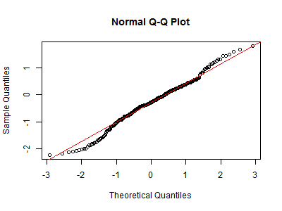
Quantile-Quantile plot is a popular method to display data by plot the quantiles of the values against the corresponding quantiles of the normal (bell shapes).
The quantiles of the standard normal distribution is represented by a straight line. The normality of the data can be evaluated by observing
the extent in which the points appear on the line.
qqnorm(y, ...)
qqnorm(y, ylim, main = "Normal Q-Q Plot",xlab = "Theoretical Quantiles", ylab = "Sample Quantiles",plot.it = TRUE, datax = FALSE, ...)
qqline(y, datax = FALSE, ...)
qqplot(x, y, plot.it = TRUE, xlab = deparse(substitute(x)),
ylab = deparse(substitute(y)), ...)
x: The first sample for 'qqplot'
y: The second or only data sample
xlab, ylab, main: plot labels. The 'xlab' and 'ylab' refer to the y
and x axes respectively if 'datax = TRUE'
plot.it: logical. Should the result be plotted?
datax: logical. Should data values be on the x-axis?
ylim: set limits of y axis
Following is a csv file example, we will draw a Quantile-Quantile plot of "Expression" values:
